← 2020 Schnitzer Prize in the Visual Arts
Jonathan Zong
Third Place, 2020 Harold and Arlene Schnitzer Prize in the Visual Arts
More about the artist
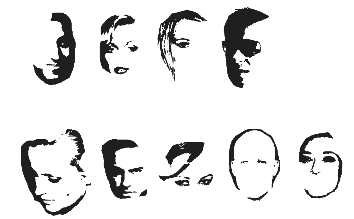
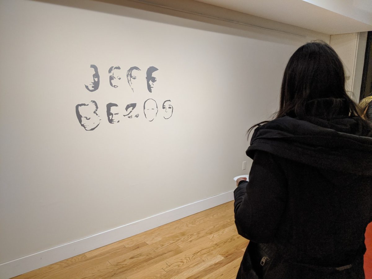
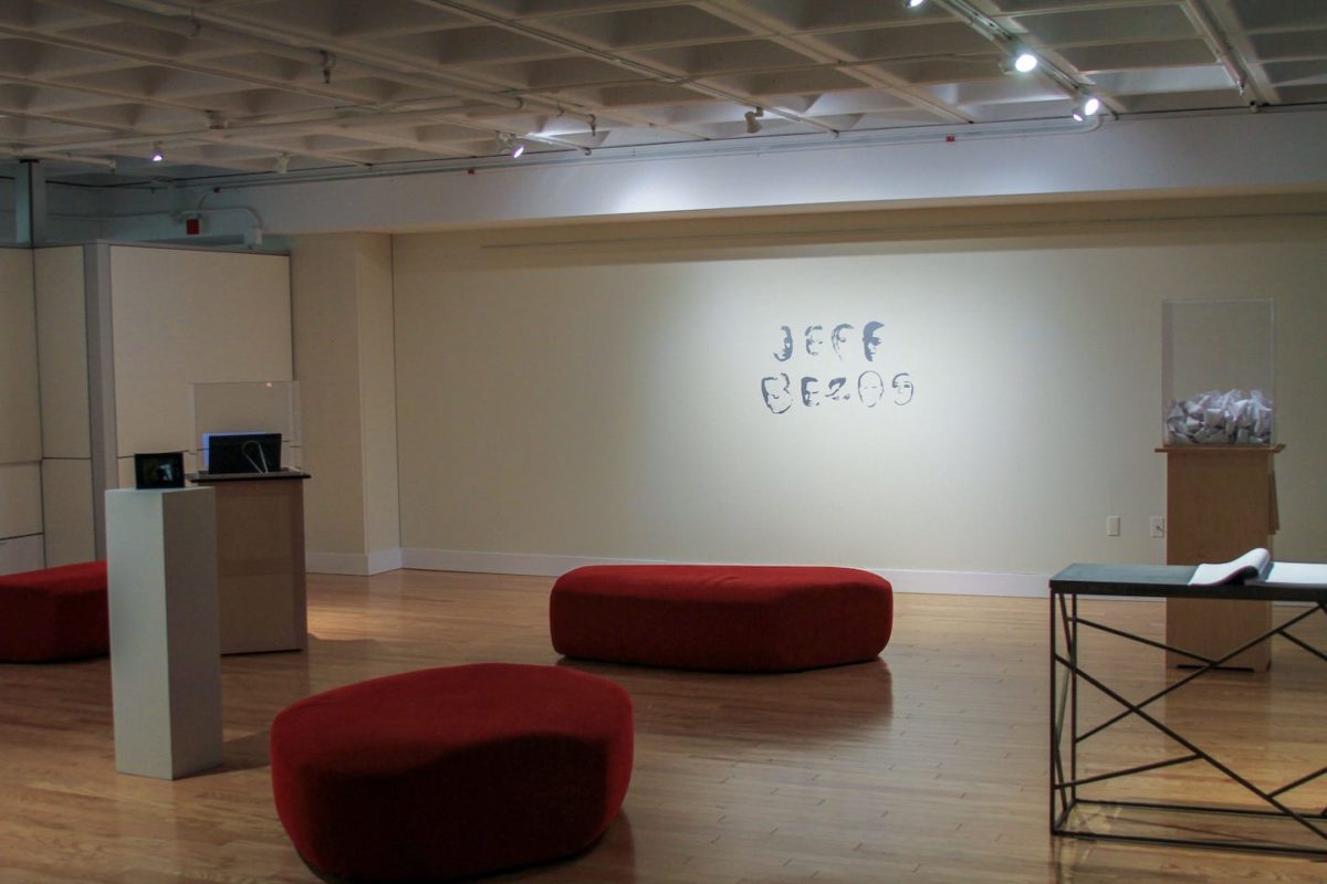
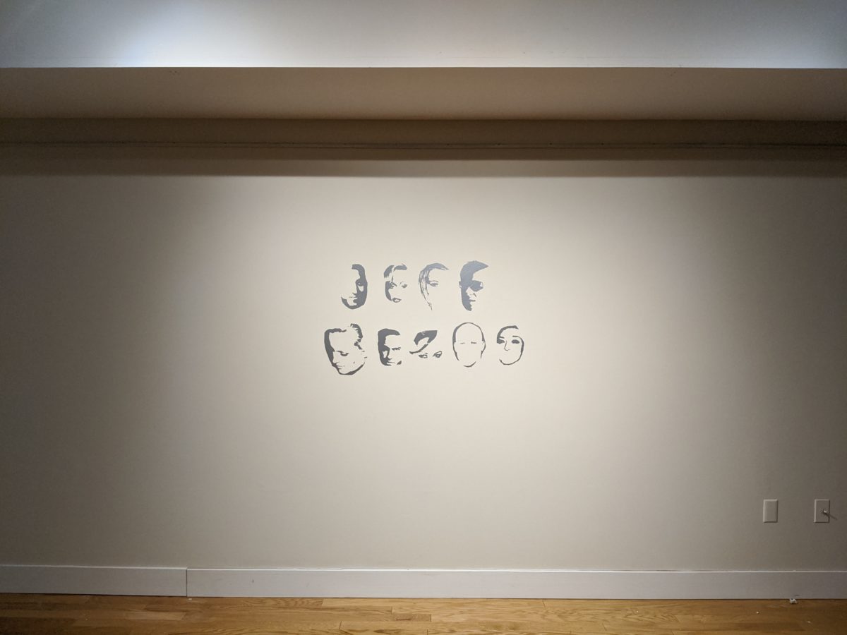
JEFF BEZOS (Public Display)
Typographic design. Vinyl wall lettering, each letter 12 in. tall. 2019.
Public Display is a handmade digital display font created by erasing parts of celebrity faces from a facial recognition training dataset. To be under a watchful and surveillant eye is a condition of hypervisibility, explored here through the intervention of erasure. Facial recognition systems are increasingly integrated into policing practices that disproportionately target communities of color. The common practice of academics and corporations building facial recognition is to mine photos of unsuspecting individuals on the internet without their knowledge or consent, public figures and private citizens alike. These entities seek to train algorithms to read patterns within faces, but the line between pattern matching and racist phrenology is often thin.
Some neuroscience researchers believe that face perception and word form recognition could be competing functions within certain parts of the brain, making it hard to read a face as a letter (and vice versa). With Public Display, I’m interested in this forced choice between the whole and the part. To read the words, one must step back and erase the individual faces, denying the individuality of each subject in order to understand its formal characteristics in aggregate—as if from the perspective of a machine. Focus too much on recognizing faces, and the words become illegible. This font places the acts of reading texts and reading faces into tension. Reading, viewing, gazing—legibility and illegibility as tools of control and resistance.
Biometric Sans
Typographic system. Variable font software, installed as digital typewriter. 2018.
Biometric Sans is an experimental typography system which elongates letterforms in response to the typing speed of the individual. It is a gesture toward the re-embodiment of typography, the re-introduction of the hand in digital writing.
The work is inspired by the practice of keystroke biometrics, the idea that individuals are uniquely identifiable by the way that they type. Typing is an instance of what Marcel Mauss calls “techniques of the body”—how movement and gesture express an individual’s socially and culturally inflected subjectivity. Typing is just as embodied as handwriting. But where handwriting expresses individuality through letterforms, digital word processing makes everyone’s writing look the same.
Writing in Biometric Sans foregrounds the mediation of writing in software. This intervention comes with an awareness of the temporality of writing. Cadences of stretched letterforms might express tone that would be otherwise lost. Typing might become a feedback loop of writing and rewriting, seeking for the right letterforms to visually express an idea. All the while, the algorithmic variation indicates the omnipresent apparatus of digital surveillance on which this artwork is based.
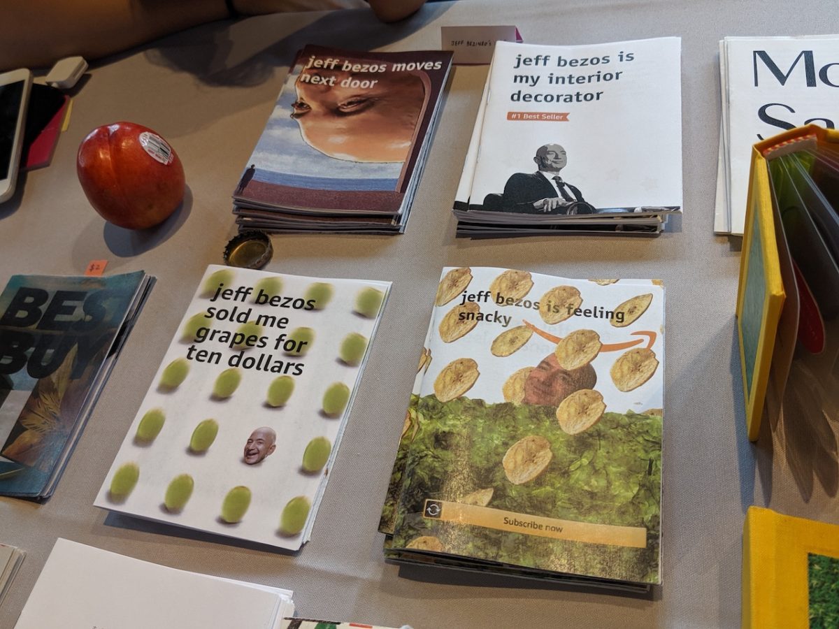
jeff bezineo’s amazine dream
Independently published zine series. Print, 4.25×5.5 in. 2018–2020.
jeff bezineo’s amazine dream is a zine series about jeff bezos. one time, he even walked past a table where these were being sold. this series is made in collaboration with kathleen ma.
issue 1: jeff bezos is my interior decorator
a story about algorithms, sameness, consumerism, and the futon that follows me everywhere.
issue 2: jeff bezos is feeling snacky
a zine about cultural commodification and amazon’s “wickedly prime” snacks.
issue 3: jeff bezos moves next door
a comic about surreality and frustration in response to amazon’s hq2 proposal.
issue 4: jeff bezos sold me grapes for ten dollars
a tragedy about grapes and food access in cambridge.
issue 5: jeff bezos sneezos
a mythos about hubris, destiny, and escape during covid-19.
jeff bezineo’s amazine dream has been shown and sold at venues including:
- Tiny Tech Zines (NAVEL Los Angeles)
- Press Play Fair (Pioneer Works)
- Odds and Ends Art Book Fair (Yale University)
- NY Tech Zine Fair (School for Poetic Computation)
- Boston Art Book Fair (Boston Center for the Arts)
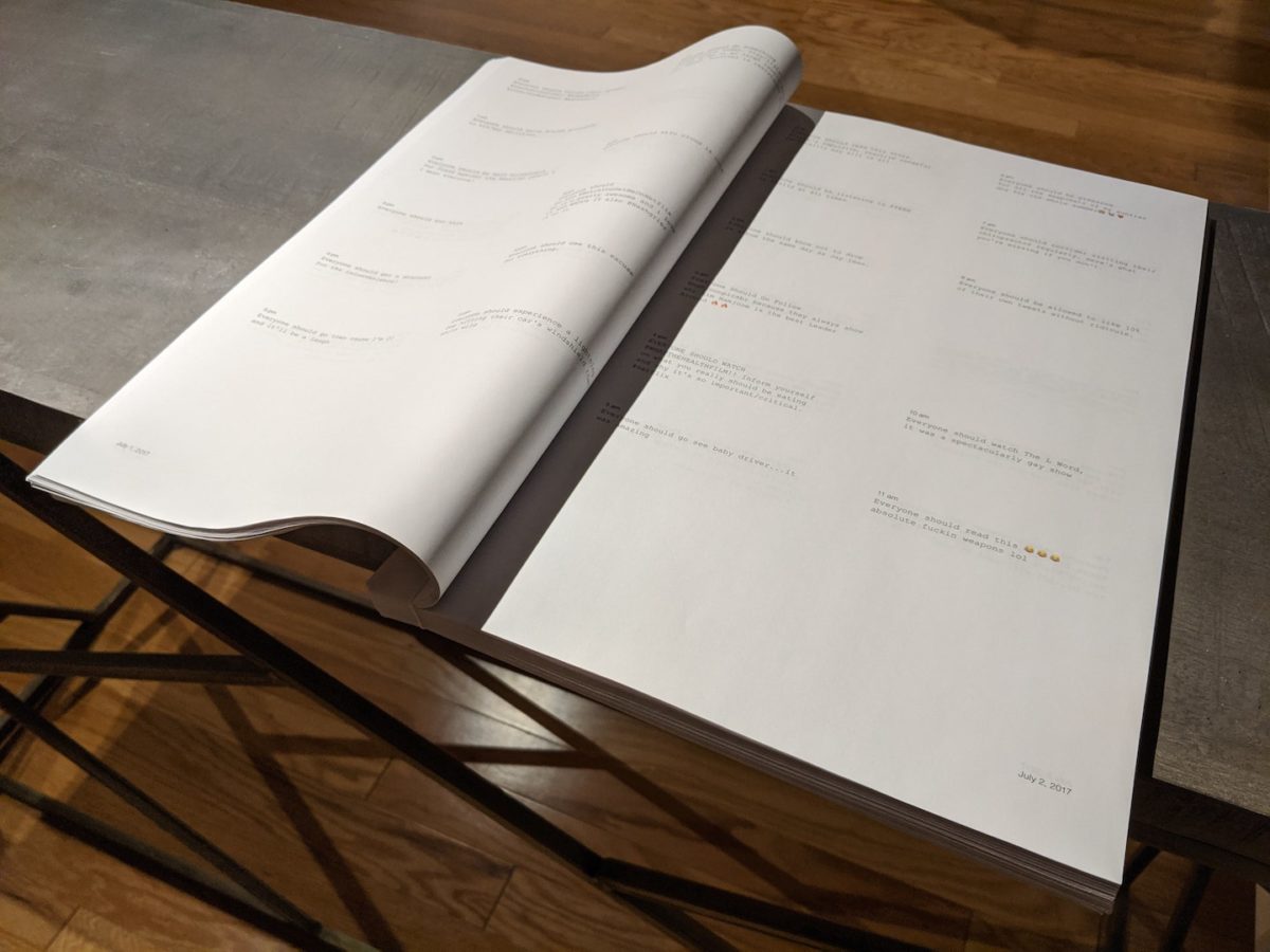
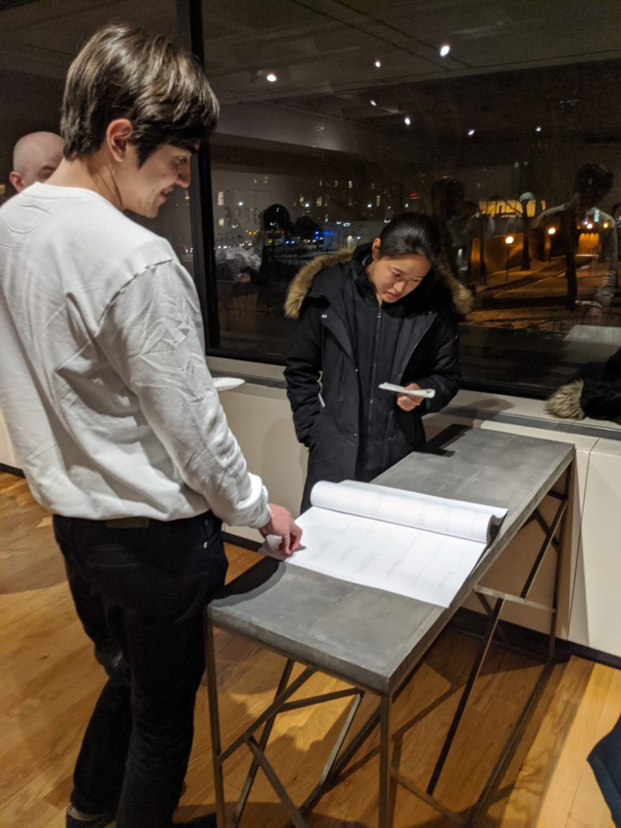
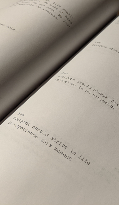
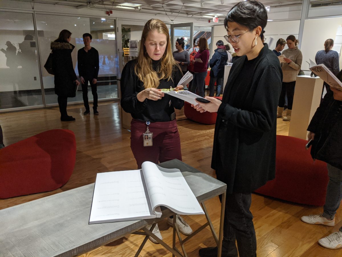
Everyone Should
Twitter bot displayed as bound volume. Print, 11×17 in., 257 pages. 2017.
Everyone Should is a book and Twitter bot. Every hour, the bot finds the most recent tweet beginning with the words “everyone should” and retweets it. These messages are collected in the bot’s timeline and in a large book designed in the form of a diary. The resulting selection of transient personal and collective moments presents an alternative model of online viewer attention—it is both archive and accumulation.
Everyone Should was shown and sold at Rhizome’s Internet Yami-Ichi at the NADA art fair, and is part of the collection at the W. Van Alan Clark, Jr. Library at the School of the Museum of Fine Arts, Tufts University.
The authoritative, attention-seeking sentiment of “everyone should” is a recurring pattern of language online. Posting something online for circulation into other peoples’ timelines implcitly assumes that whatever you post is so interesting that it deserves to be foisted onto others while they browse; whether or not the actual words “everyone should” are used, it is built into the form of a tweet.
This project also suggests an alternative way to select and filter content out of the endless stream. Instead of the complex popularity weighting and demographic targeting algorithms that platforms like Twitter use to surface material, the project uses a pattern of language. The resultant accumulation becomes a strange archive of personal and collective moments that are otherwise lost in the flood.
Maintaining this project over time put me in the position of editor, curator, and content moderator. The bot sometimes retweeted racist or violent speech. I had to make normative judgments about what counted as unacceptable speech, and act to remove it. But at Twitter’s scale, it was impossible for me to review everything. This is the core dilemma of governing online platforms.
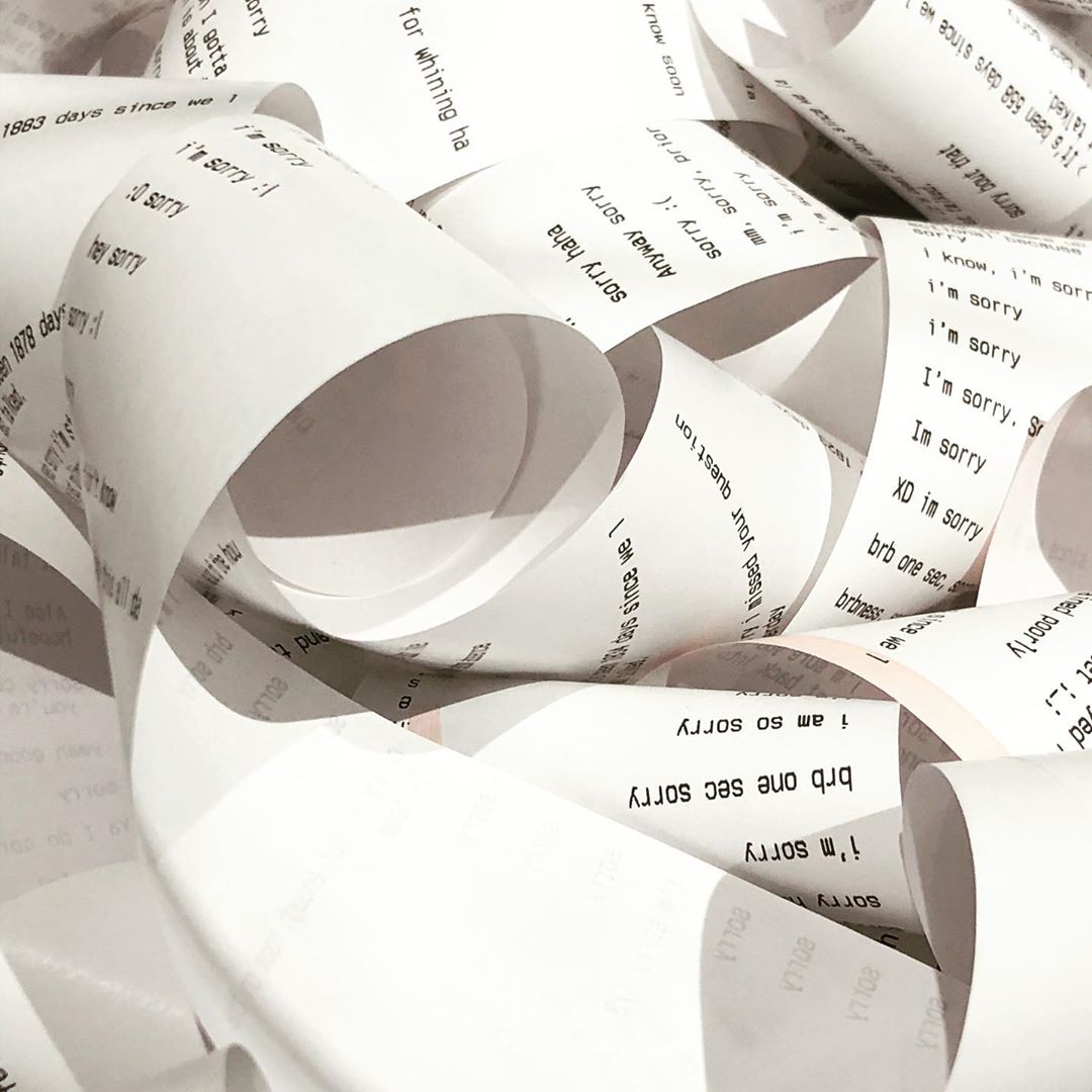
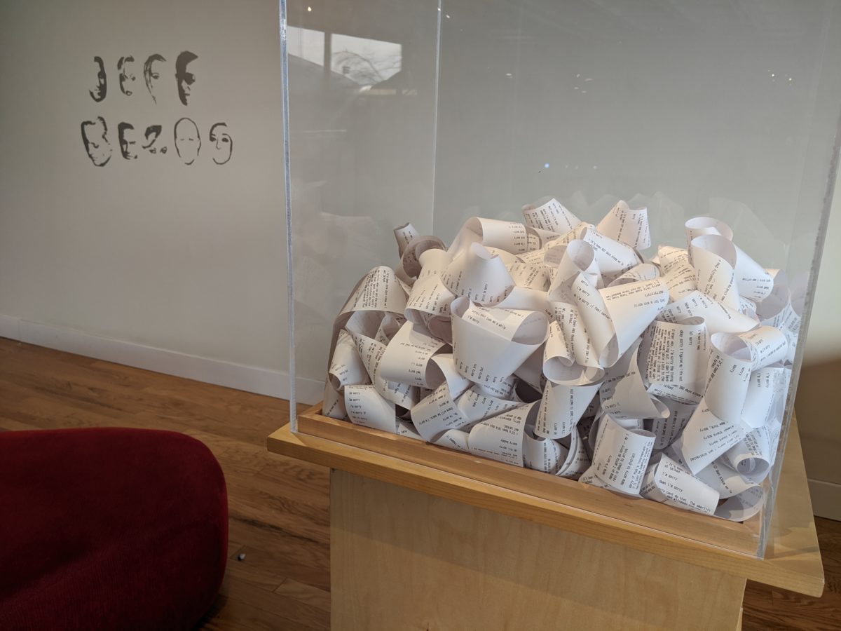
A Box of Apologies (2008–2018)
Digital archive. Printed as a long roll of receipts, 2¼ in. × 85 feet. 2018.
This box contains a record of every time I said “sorry” in Facebook Messenger over the course of a decade.
Social media is often curated as a shrine to our personal bests. A Box of Apologies repurposes my social media archive as a testament to my personal failures. Digging through a dataset of every Facebook Messenger conversation I had from 2008 to 2018, I constructed this work to reflect on a decade of life lived online.
Many entries are generic or reflexive apologies. But every so often amid the short bursts of “sorry,” there is a message that feels specifically situated in a time and a place—references to past interests, past relationships, past deadlines.
All these moments are held within a tangled mess, encased in a glass box, set with sorrow for the sorrys I’ve said.
About the Artist
“I am an artist who works with graphic design as my material. I use its conventions and processes to think about technologies of social mediation and power. I work to imagine and build the repaired world I want to live in years and decades from now. In my practice, I’ve experimented with 3D printed letterpress type, printed books collecting algorithmically curated found material, and created data visualizations that have sparked conversations in The New York Times. Working with visual form in a digital substrate helps me think about the continually negotiated boundary between bodies and machines in society. How should designers think about the social commitment of the forms they create? Answering this question will help me—and the field of contemporary art—come to a new understanding of design’s present and future territory.”
Jonathan Zong is a visual artist and computer scientist interested in the imperfect ways that interface design makes people and systems legible to each other. He is currently a graduate researcher at MIT CSAIL, where he is pursuing a PhD in Human-Computer Interaction. Previously he has worked at Google Design and Linked by Air.
His graphic design work won 3rd place in the juried student competition at the 2017 Biennale de Design Graphique in Chaumont, France. His research and public scholarship, which run parallel to his art practice, has been published in Slate, the ACM Conference on Computer Supported Cooperative Work, and the Liminalities Journal of Performance Studies.
Jonathan graduated from the Visual Arts and Computer Science departments at Princeton University in 2018. At Princeton, he was a recipient of the Lucas Award in Visual Arts and the Santos-Dumont Prize for Innovation. He is a 2019 Paul and Daisy Soros Fellow and an NSF Graduate Research Fellow.
More at Jonathan Zong’s website
Back to 2020 Schnitzer Prize in the Visual Arts
Jonathon oZng’s Application Video